Wyckoff summarised his ideas in schematic diagrams that label the events inside accumulation and distribution ranges. They are idealised maps — a shared vocabulary for the sequence of behaviour, not templates that any real chart will match exactly.
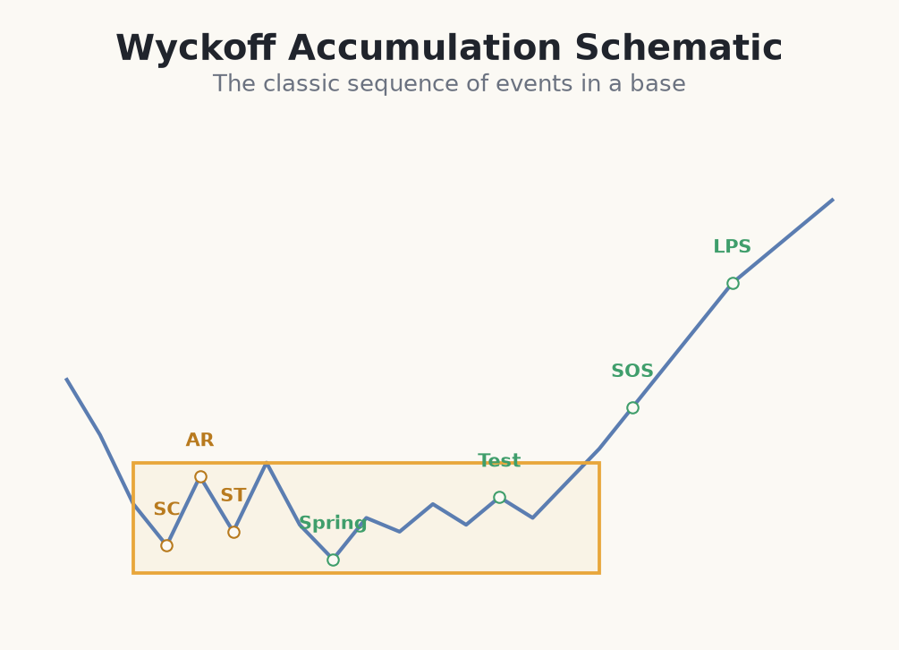
Accumulation events
- PS (preliminary support): early buying appears as the decline slows.
- SC (selling climax): a sharp, high-volume capitulation low.
- AR (automatic rally): a sharp bounce as selling dries up, setting the range top.
- ST (secondary test): a return toward the SC lows on lighter volume.
- Spring: a false break below support that shakes out sellers.
- Test: a low-volume retest confirming supply is gone.
- SOS (sign of strength): a wide, high-volume rally out of the range.
- LPS (last point of support): a higher low on the pullback after the SOS.
Distribution events (the mirror)
- BC (buying climax): a sharp, high-volume surge that marks the top.
- AR (automatic reaction): a sharp drop that sets the range bottom.
- ST (secondary test): a return toward the highs on lighter volume.
- UTAD (upthrust after distribution): a final failed break above resistance.
- SOW (sign of weakness): a wide, high-volume break down out of the range.
- LPSY (last point of supply): a lower high on the bounce after the SOW.
The value is in the sequence and logic, not the labels themselves. A climax leads to an automatic move, which defines the range; tests probe the extremes; a spring or upthrust shakes the wrong side; and a sign of strength or weakness confirms the resolution.
How to use the schematic as a checklist
Do not hunt for a chart that matches the diagram pixel-for-pixel — use the schematic as a sequence checklist. Ask in order: has there been a climax and automatic move to define the range? Have the extremes been tested on lighter volume? Has a spring or upthrust shaken the obvious side? And has a sign of strength or weakness confirmed direction? The more events you can tick off in order, the higher-confidence the read. Missing or out-of-order events mean a lower-confidence setup, not an automatic no-trade.
Walking an accumulation schematic on a live chart
- 1A stock sells off into a selling climax (SC) at €48 on huge volume, then bounces to €53 — the automatic rally (AR) — defining a range of €48–€53.
- 2Price returns to €48.50 (secondary test, ST) on lighter volume — supply is thinning. The range is maturing.
- 3Weeks later a spring stabs to €47.20 and snaps back inside; a low-volume test holds at €48.80. The last sellers are out.
- 4A wide bar breaks €53 to €54.50 (SOS) on heavy volume. You wait for the LPS pullback to €53.30 and buy at €53.40, stop at €52.40 (risk €1.00).
- 5Account €1,000, risk 1% = €10, so 10 shares (≈€534). The €5 cause projects toward ~€58, roughly 4.6:1.
- 6Because you ticked every event in order, this is a high-confidence read — but a close under €52.40 still means out.
Schematics are a vocabulary for the accumulation and distribution sequence — read the story they tell, not the exact shape.
Common beginner mistakes with schematics
- Force-fitting the diagram onto every chart. Real charts skip events, reorder them, and repeat them. If you have to squint to see the schematic, it probably isn't there.
- Labelling in hindsight and calling it skill. It is easy to name a spring after the rally. In real time the same bar could be a genuine breakdown — the labels are provisional.
- Treating a single event as a trade. One ST or one AR is not a setup. The edge is in the sequence confirming, not in spotting a lone label.
- Waiting for a 'perfect' schematic and missing the trade — or forcing an imperfect one. Balance matters: demand enough of the sequence to trust it, but accept that clean textbook shapes are rare.
- Dropping risk management because the schematic 'confirmed'. A fully-labelled range still fails. Every entry needs a stop beyond the event and a small position size.
Real charts rarely match the textbook. Events appear out of order, get skipped, or repeat, and hindsight makes labelling look easier than it is in real time. Use the schematic as a checklist of what to look for, then defer to what price and volume actually do.