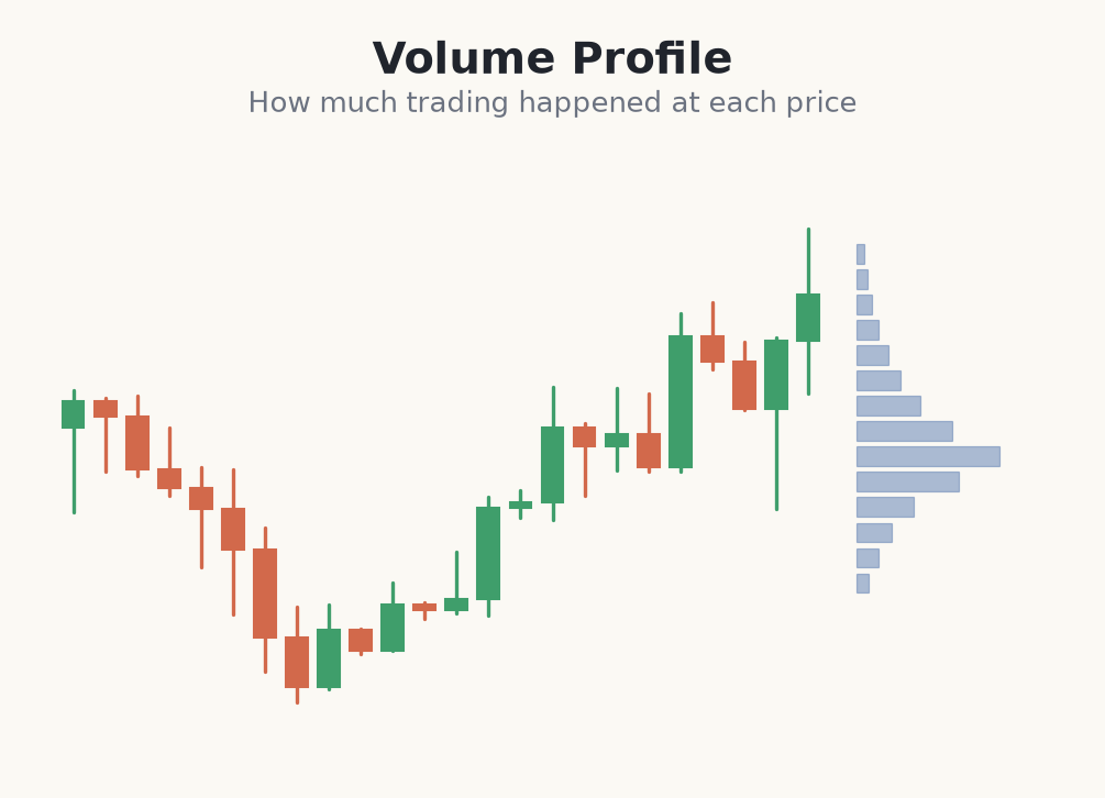
A volume profile turns the volume question on its side. A normal volume panel shows volume per period of time — one bar per candle. A profile instead shows volume per price level: a horizontal histogram drawn beside the chart, with longer bars at the prices where more activity took place. Rotating the axis from time to price is a small change with a big payoff, because most decisions traders care about are about prices, not clock time.
This answers a different question. A time-based panel tells you "when was the market busy?"; a profile tells you "where did the market trade most?" Prices with long profile bars are areas of agreement where buyers and sellers were both comfortable transacting; prices with short bars are areas the market passed through quickly because few wanted to deal there. That single shift lets you see structure a candle chart hides.
How to read the shape
The overall shape tells a story before you look at any single level. A profile with one fat bulge in the middle shows a balanced, accepted price area — the market found value and rotated around it. A profile with several separate bulges shows the market found value at more than one place, often meaning a trend that paused, moved, and paused again. The peaks and valleys of the profile become the specific levels — POC, value area, HVN and LVN — studied in the next modules.
The profile you build depends entirely on the range you select. A single-session profile answers intraday questions about today's fair value; a profile drawn over an entire trend answers where long-term value sits. Match the range to the timeframe you actually trade, and be aware that the same chart produces very different profiles depending on where you start and end the calculation.
- <strong>The profile plots</strong> volume by price, not by time.
- <strong>Long bars mark</strong> prices the market accepted and traded around.
- <strong>Short bars mark</strong> prices the market rejected or passed through fast.
- <strong>Shape matters</strong> — one bulge is balance, several bulges is multi-distribution.
- <strong>Choose the range</strong> carefully — session, day, week or a whole swing.
Building and reading a session profile
- 1On the 5-minute S&P 500 futures chart you select the whole cash session and draw a volume profile over it.
- 2The histogram shows one dominant bulge centred near 5,320, where the longest bars cluster — the market's most-traded zone for the day.
- 3Above and below, the bars shrink quickly, telling you the session accepted price mainly in a tight band from 5,308 to 5,332.
- 4You note the fat middle as your reference for tomorrow: if price opens back inside it, expect rotation; if it opens outside and holds, the market may be seeking new value.
- 5You do not trade the profile blindly — you use it to plan. A long only makes sense if price returns to the lower edge near 5,308 and buyers actually show up there.
- 6This read is context: it tells you where the crowd agreed today, which frames every decision the next modules build into a trade.
Common mistakes reading a volume profile
- Using the wrong range. A profile over a random window produces meaningless levels. Anchor it to a session, a day, or a complete swing you actually care about.
- Confusing the profile with a signal. A long bar shows where trading happened, not which way price goes next. It is a map, not an arrow.
- Reading absolute lengths. What matters is which bars are long relative to the rest of the profile, not the raw numbers behind them.
- Ignoring the shape. A double-bulge profile means something very different from a single fat bulge. Read the whole silhouette before zooming into levels.
- Forgetting the data caveat on CFDs. A profile built on tick volume is an approximation. Treat the levels as zones, not exact prices.
A volume profile maps where the market traded most — turning volume from a timeline into a map of accepted and rejected prices.
Everything that follows — point of control, value area, high and low volume nodes — is just a way of naming the features of this profile. Learn to read the shape first, and the specific levels become obvious rather than arbitrary.